Enterprise Product Design / Internal Tools / Front-End Prototyping

Turning a week of executive whiteboarding into a working internal dashboard the engineering team could connect directly to its back end.

1Week On-Site in NYC
E2EUX Through Front End
HTMLWorking Handoff

The output was not a static design file. It was a functioning front-end prototype built for direct internal integration.

Fortress IT dashboard overview

A global internal tool designed to simplify onboarding, service requests, and everyday IT administration.

Fortress Investment Group brought me in to design part of a broader global IT intranet initiative. The focus was the employee dashboard used for onboarding, common requests, support, and recurring administrative tasks.

This project was part of a nearly decade-long relationship with Fortress and its extended portfolio. Over that period, I designed Fortress.com, roughly half of the firm's ten to twelve portfolio-company websites, and a wide range of supporting digital and marketing work. The remaining portfolio sites were handled by internal teams, while Fortress continued to bring me into initiatives that required an outside design partner who already understood the organization, its standards, and its stakeholders. The relationship extended beyond major web and product efforts to recurring needs such as presentations, campaign materials, and the firm's annual holiday card.

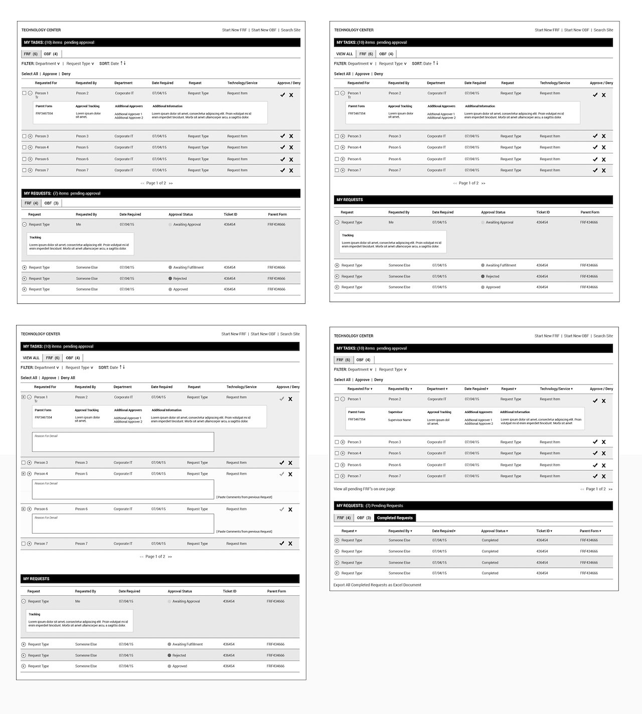
The work began on-site in New York City with the CTO and a group of his directors. Over the course of a week, we whiteboarded workflows, debated priorities, and worked through how employees should enter the system, what they should see first, and how the most common actions could be completed with less friction.

After the workshop, I took the agreed structure away, designed the interface, and built the working front end myself. I then handed Fortress a functioning HTML file that their internal team connected to the back end.

01The Assignment

A Global IT Intranet Needed a Clear Front Door

The broader initiative covered a global internal IT environment, but this part of the work focused on the dashboard employees would use for onboarding and day-to-day requests.

The existing process placed too much administrative burden on employees and IT staff. Common tasks were distributed across different pathways, important actions competed with lower-priority information, and the interface did not clearly reflect how people actually used the system.

The dashboard needed to become a practical front door: clear enough for a new employee, efficient enough for frequent users, and structured enough to support the larger intranet behind it.

The design problem was not adding more functionality. It was deciding what deserved attention first.
02The Workshop

One Week in New York With the CTO and His Directors

I spent a week on-site in New York City working directly with the CTO and members of his leadership team. The room included people responsible for different parts of the IT organization, each with a legitimate view of what the dashboard needed to support.

We worked through the product in real time on whiteboards. We mapped employee needs, common service requests, onboarding steps, ownership, escalation paths, and the relationship between summary information and deeper workflows.

The value of the workshop was not simply gathering requirements. It created shared agreement among decision-makers before design and development began.

Priorities

Identified which actions were used most often and which deserved immediate placement on the dashboard.

Workflows

Mapped how onboarding, support, and service requests moved across employees and internal IT teams.

Alignment

Used the workshop to resolve competing assumptions before they became interface or engineering problems.

03The Product Model

The Dashboard Became a Layer of Prioritized Actions

The whiteboarding sessions made it clear that the dashboard could not treat every task equally. Employees needed fast access to the actions they performed most often, while less frequent or more complex tasks could remain available without dominating the page.

I organized the experience around a small set of high-value entry points supported by status, context, and secondary navigation. This reduced the amount of searching required and made the system feel less like an intranet directory and more like an operational tool.

The interface was designed to surface the most useful information at the right level, then allow employees to move deeper only when necessary.

01 / EnterProvide a clear landing point for onboarding, support, and everyday IT activity.
02 / PrioritizeElevate the most-used tasks instead of presenting every capability with equal weight.
03 / ActReduce the number of steps required to start and complete common requests.
04 / TrackGive employees visibility into status and next steps without unnecessary navigation.
04The Interface

A Dense Enterprise Tool Needed to Feel Immediate

Internal enterprise tools often accumulate complexity because every department has something important to add. The interface had to acknowledge that complexity without exposing all of it at once.

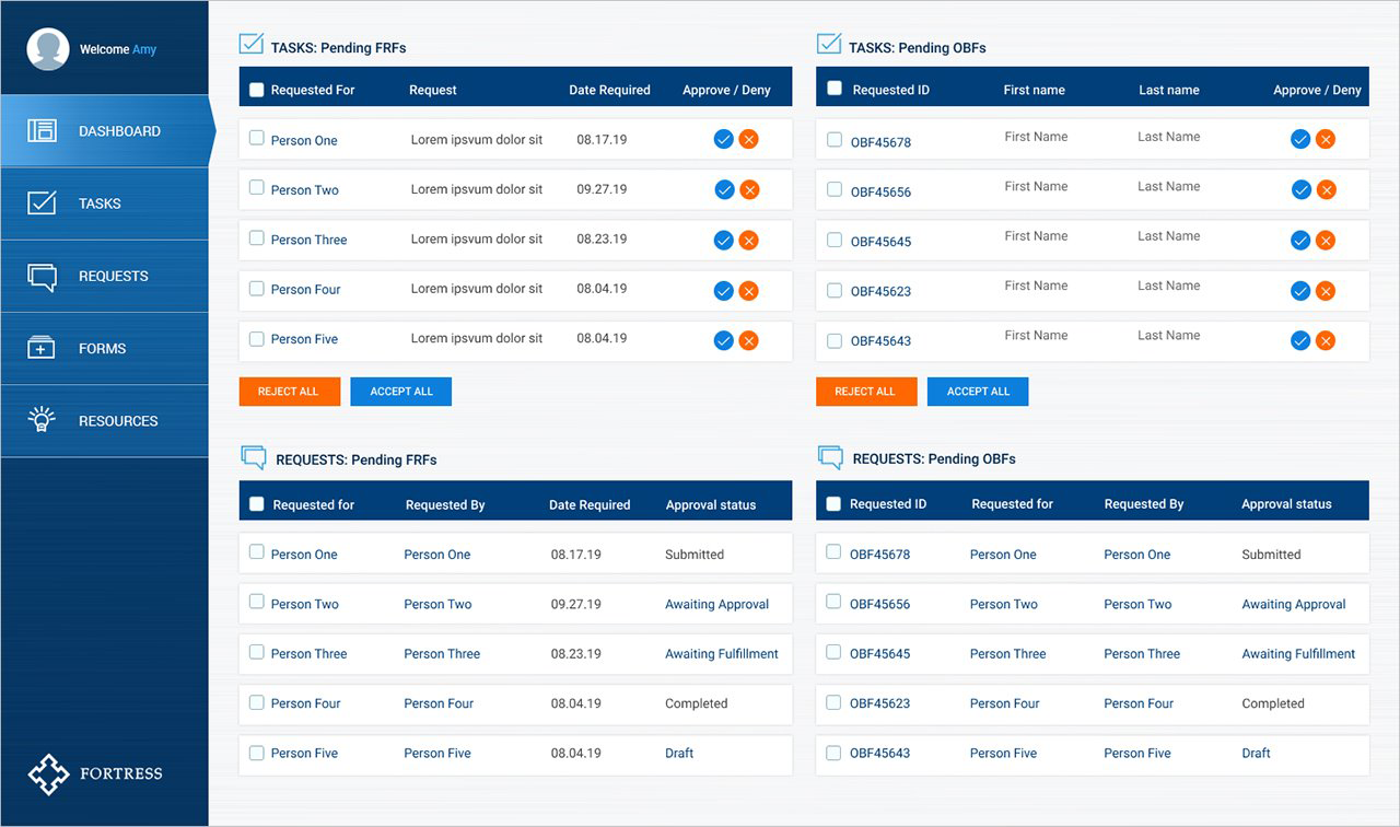
I used clear hierarchy, modular panels, prominent task areas, and restrained visual styling to create a dashboard that felt focused rather than overloaded. The design emphasized usefulness over decoration and made the most frequent workflows visible without forcing users through a deep navigation structure.

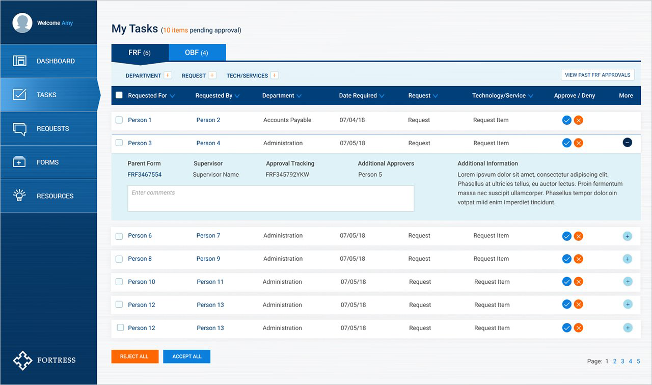
Fortress dashboard interface view

Primary actions and high-value information were elevated into a clear dashboard hierarchy.

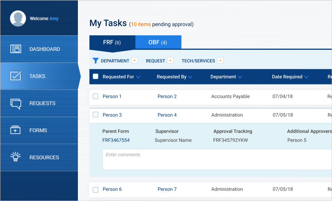
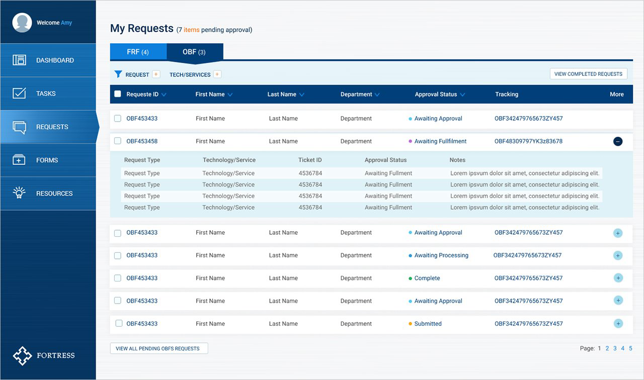
Fortress IT dashboard request flow

Request and support flows were structured to minimize the time employees spent navigating administrative tasks.

Fortress dashboard detail screen

Secondary screens extended the same design language without losing the dashboard's sense of clarity.

05The Build

I Left the Workshop, Built the Front End, and Returned With Something Real

Once the workshop established the product direction, I moved directly from concept into execution. I designed the interface, translated the layouts into working front-end code, and tested the experience as an actual browser-based product rather than a set of isolated screens.

This changed the quality of the handoff. The internal team did not need to reconstruct spacing, states, hierarchy, or responsive behavior from static mockups. They received a functioning HTML file that expressed the intended experience directly.

Fortress then connected that front end to its internal back-end systems.

The prototype was the specification. The handoff preserved the design by giving engineering working code instead of interpretation.

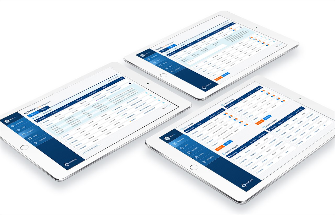
Fortress dashboard working interface

The final front end reflected the decisions made during the executive workshop and was prepared for internal integration.

Fortress dashboard component and interaction detail

Detailed interaction and interface states were encoded directly into the working HTML handoff.

06The Handoff

Design and Engineering Met in the Same Artifact

The project did not end with a presentation or visual specification. The deliverable was a working front-end implementation that the internal Fortress team could connect to its own systems.

That approach reduced ambiguity at the most fragile point in the process. The spacing, structure, visual hierarchy, and interaction intent were already present in the artifact engineering received.

It also demonstrated a working model for executive collaboration: align quickly in the room, translate decisions into a coherent product, then hand off something concrete enough to move directly into production.

Executive Alignment

Converted a week of whiteboarding with senior IT leadership into a shared product direction.

Product Design

Reduced a complex internal environment into a focused dashboard organized around real employee needs.

Working Delivery

Built the front end and delivered functional HTML for direct connection to the internal back end.

07The Takeaway

The Fastest Path to Clarity Was Working Together, Then Building It

The strength of the project came from the sequence. The leadership team aligned together in the room. I took responsibility for translating that alignment into a coherent interface. Engineering received a working front end instead of a loose interpretation of the design.

For internal tools, that kind of continuity matters. Employees do not care how many systems sit behind the experience. They care whether the tool helps them complete the task quickly and with confidence.

The Fortress dashboard turned a complex set of internal IT workflows into a cleaner operational layer, and it moved from whiteboard to working browser experience without losing the decisions made along the way.