Behavioral Healthcare / UX Design / Responsive Product Systems

Rebuilding a behavioral health platform into a clearer, more accessible, and more scalable experience in six weeks.

130+Desktop + Mobile Designs
100+Pages Consolidated
6Week Timeline

One lead designer, a compressed timeline, and a complete responsive system spanning search, location content, and reusable page architecture.

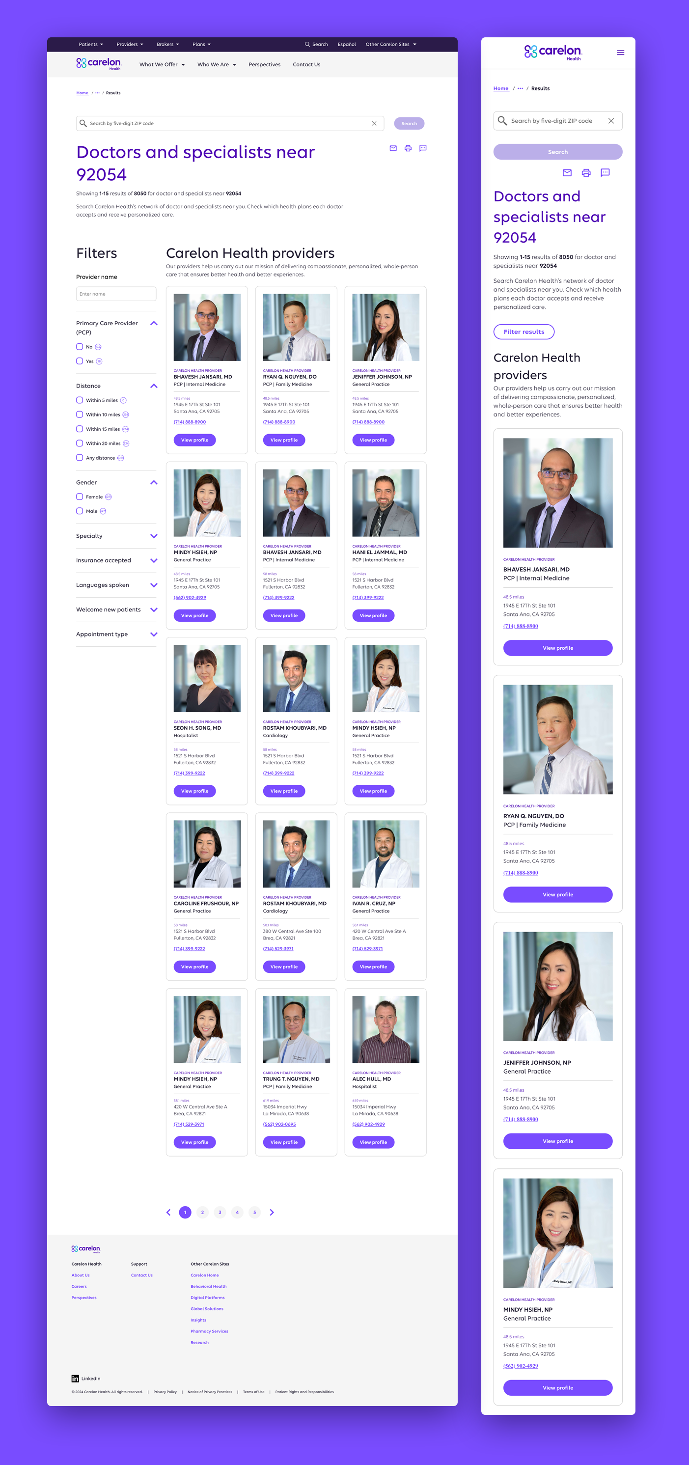
Carelon Behavioral Health provider search results

Selected public-facing screens from a broader behavioral health platform redesign.

Behavioral healthcare presents a different kind of UX challenge. People may arrive during moments of stress, urgency, or uncertainty, which makes clarity, accessibility, and speed more important than visual complexity.

As the lead UX designer, I owned the redesign of Carelon Behavioral Health's public platform, including provider search, responsive page templates, location content, and the consolidation of a fragmented set of pages into a more maintainable system.

The work was completed on an aggressive six-week timeline and required more than 130 desktop and mobile designs, close coordination with product and content partners, and a handoff structured for immediate production use.

01The Challenge

Behavioral Health Users Need Clarity Before Complexity

The site served members, providers, employers, and people actively looking for care. Those audiences arrived with different goals, levels of familiarity, and urgency.

The redesign needed to reduce confusion across navigation, search, location content, and service information while still meeting enterprise requirements for accessibility, compliance, content governance, and reusable implementation.

In behavioral healthcare, finding the right next step is not a secondary usability detail. It is the core of the experience.

02One Template, Not 100 Pages

The Largest Efficiency Gain Came From Redesigning the System, Not the Pages

The existing experience included more than one hundred doctor and care center location pages with overlapping structures and repeated content needs.

Rather than redesign each page independently, I created one flexible location-detail template capable of supporting the full range of provider and care-center content. The template handled variations in services, contact information, supporting content, and location details without requiring a separate design for every page.

This reduced development effort, avoided unnecessary component enhancements, improved consistency, and made the system easier to maintain over time.

Before

More than 100 similar pages with fragmented patterns and repeated implementation effort.

System Move

One flexible page model designed around reusable content and component behavior.

After

A consistent experience with lower build cost and simpler long-term maintenance.

03Provider Search

Search Had to Support Decisions, Not Just Return Results

The provider search experience was one of the most important parts of the platform. Users needed to move from a broad need to a relevant care option without being overwhelmed by filters, terminology, or dense result sets.

I focused the experience around clear result hierarchy, useful metadata, understandable filtering, and responsive behavior that preserved the same decision-making flow across desktop and mobile.

Carelon provider search results

Search results organized around clear provider information and next actions.

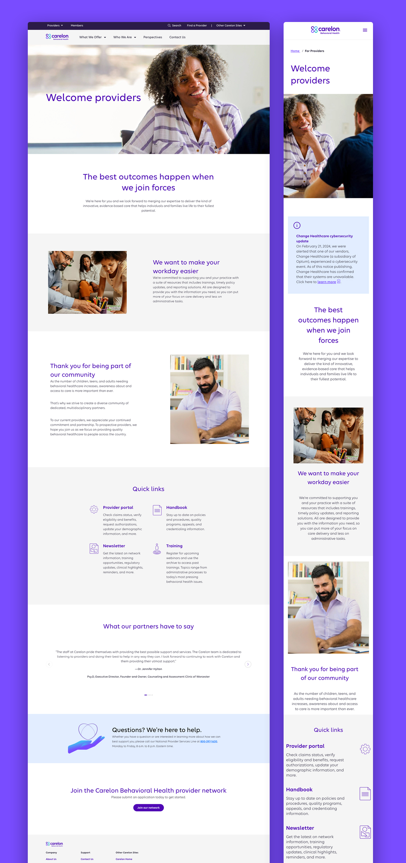
Carelon behavioral health provider page

Supporting provider content extended the same hierarchy into deeper detail.

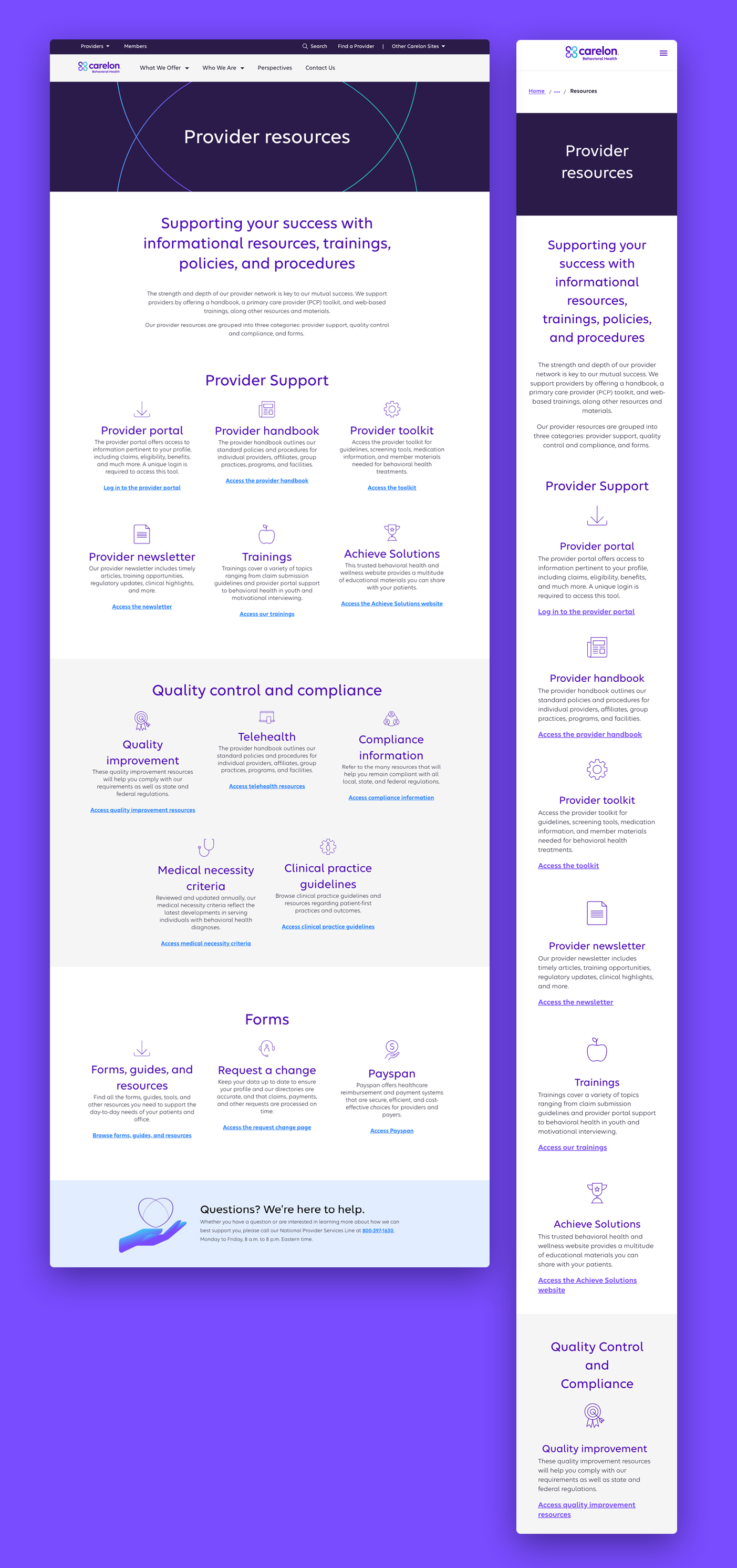
Carelon care location page

Location and service information was structured to remain useful under stress or urgency.

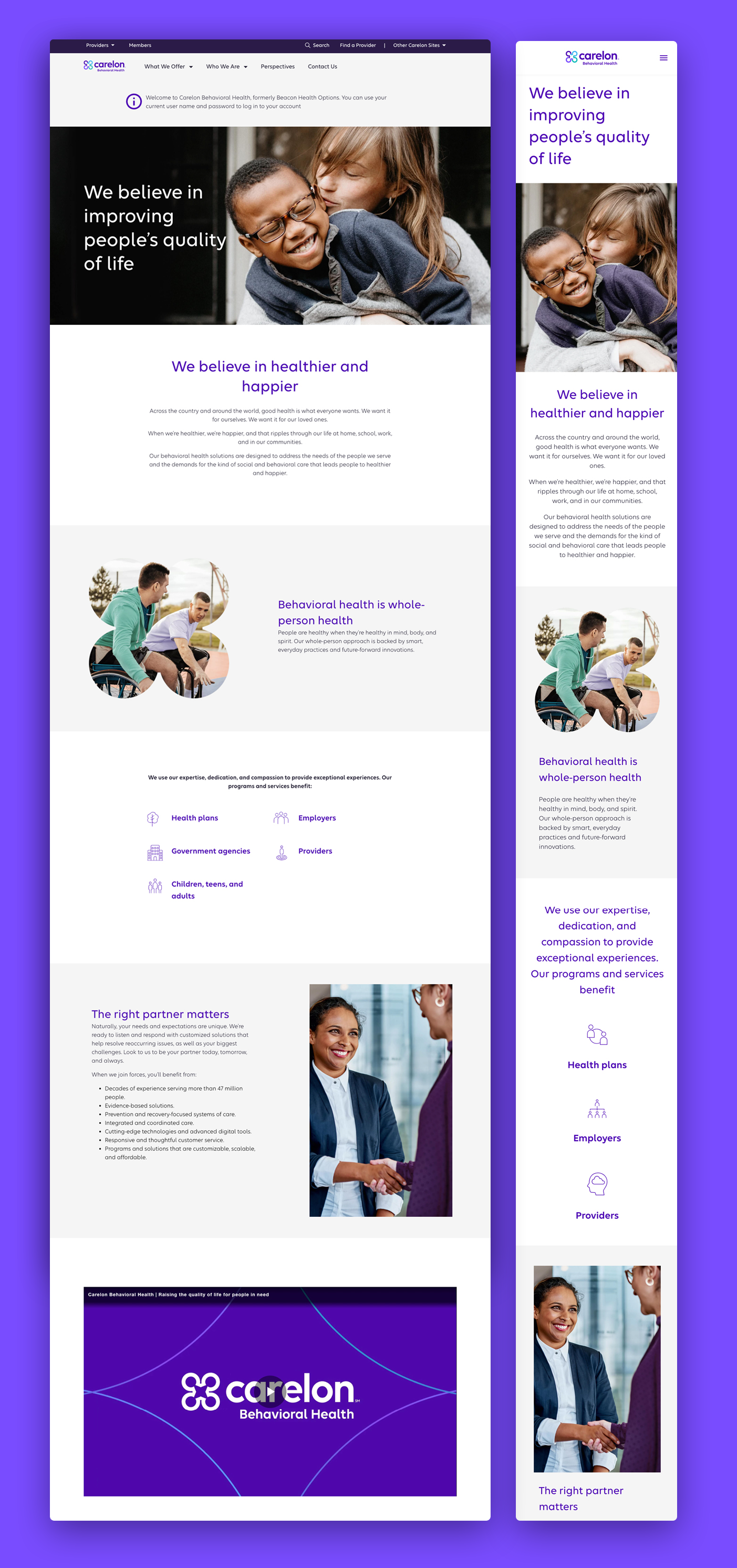
Carelon behavioral health page

The broader experience used reusable patterns to maintain consistency across content types.

04Responsive System

More Than 130 Designs Became One Coherent Product Language

I produced more than 130 desktop and mobile mockups and corresponding wireframes during the six-week engagement. The volume was high, but the goal was not to create 130 disconnected screens.

The work was organized around reusable page structures, shared content patterns, component reuse, responsive rules, and a common visual hierarchy. That made it possible to move quickly without sacrificing consistency.

Responsive by Design

Desktop and mobile were designed together instead of treating mobile as a late adaptation.

Reusable Patterns

Shared structures reduced duplication across provider, employer, member, and care-seeking experiences.

Production Ready

Files and flows were organized for rapid implementation under an aggressive deadline.

05Delivery

A Compressed Timeline Required Decisive Product Judgment

As the sole designer, I worked directly with product management, content, and stakeholders to make decisions quickly and keep the system moving toward production.

The compressed schedule made QA one of the most important parts of the engagement. I conducted extensive design QA across desktop and mobile, documented issues in detail, returned them to development, and then reviewed the fixes again. Many pages required two or three complete review cycles before they matched the approved layouts, content hierarchy, responsive behavior, and accessibility requirements. That process was time-intensive, but it was essential to protecting quality when more than one hundred pages were moving through implementation at once.

The timeline left little room for open-ended exploration. I had to identify where custom design was necessary, where existing components could be reused, and where a stronger template could solve many pages at once.

The result was a complete responsive redesign delivered in six weeks, with a clearer provider-search experience and a more scalable foundation for future content.

Speed

Delivered a broad responsive platform redesign in six weeks.

Scale

Consolidated more than 100 pages through a reusable template strategy.

Ownership

Led UX from structure and wireframes through responsive mockups and production handoff.

06The Takeaway

The Strongest Design Decision Was Architectural

The most important outcome was not any individual screen. It was the shift from a collection of pages to a reusable system.

By treating provider search, location content, and responsive page design as connected parts of one product, the redesign improved the customer experience while also reducing implementation and maintenance cost.

Because of NDA restrictions, I cannot show internal process files or unpublished work. The public screens on this page represent a much larger body of responsive UX, system design, and enterprise delivery.