Independent Product / Breathwork Program / Brand & Production System

REATHmg re-designs how beginners learn breathwork by turning a fragmented, intimidating practice into a structured product experience.

60 Day Guided Program
17 Audio Sessions
2hr+ Recorded Guidance

A wellness practice treated like a product design problem: reduce friction, create a mental model, guide repetition.

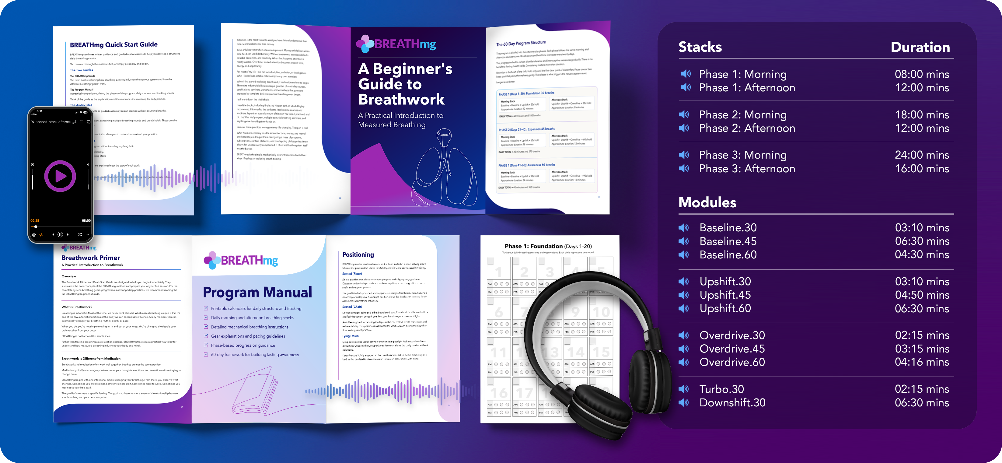
BREATHmg product hero showing guided breath training materials

BREATHmg includes a brand system, Shopify launch funnel, beginner bundle, ebook, program manual, progress trackers, guided audio, and social launch content.

BREATHmg is an introductory breathwork program designed to make breath training feel clear, practical, and accessible. It removes the mysticism, gatekeeping, expensive retreats, certification culture, and overly complicated apps that often surround the practice.

The project began out of need. I made the original guided sessions because I was tired of jumping between YouTube channels, apps, teachers, and disconnected breathing patterns to cobble together a routine I had already developed through years of trial, repetition, and personal practice.

That personal frustration became the design brief: how do you take something invisible, automatic, culturally loaded, and hard to explain, then turn it into a beginner-friendly product people can understand and repeat?

01The Need

It Started as a Personal Workaround

My own breathwork practice developed through a messy combination of traditions, teachers, videos, nervous system language, performance breathing, meditation, and experimentation. Some resources were useful. Many were confusing. Almost none of them felt designed as a coherent beginner experience.

The problem was not that breathwork lacked value. The problem was that the on-ramp was fragmented. A new user might find one teacher talking about trauma release, another talking about ancient wisdom, another talking about oxygen, another selling a week-long retreat, and another offering a random five-minute breathing pattern with no context.

I started making my own guided tracks so I could stop hunting for the right session and simply press play. Those early recordings were functional, not polished. But they revealed the product opportunity. The practice became easier to repeat when the instructions, pacing, structure, and intent all lived in one place.

The first design insight was simple: the value was already in the practice. The missing piece was usability.

02The Problem

Breathing Is Automatic, So People Assume There Is Nothing to Learn

Breathwork has a strange UX problem. Everyone already breathes. Because the activity is automatic, it is hard to convince someone that changing the pace, depth, rhythm, or hold pattern can meaningfully alter their state.

That meant the product could not rely on abstract claims or spiritual language. It needed a framework that made the mechanism feel obvious. Small changes in timing had to feel like meaningful controls, not random exercises.

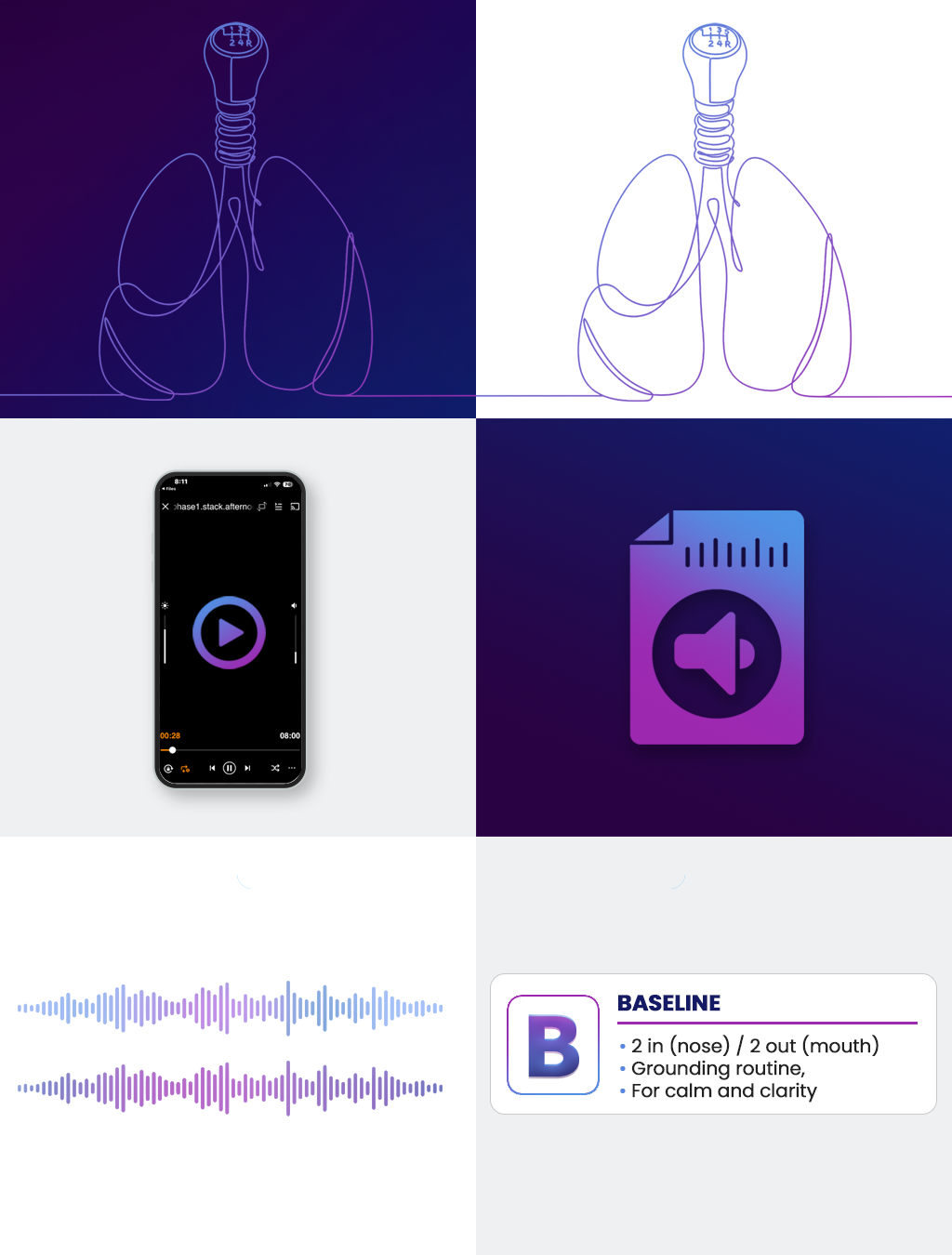
That is where the gears came from. The program reduces the practice into a few clear breathing gears. Change the ratio, and you change the experience. A one-second shift in pace can make the body feel calmer, more activated, more focused, or more settled. The metaphor gives people a mental model before they have deep experience.

Baseline 3/3A steady entry gear for rhythm, consistency, and returning attention to the body.
Upshift 2/2A faster gear for activation, energy, and building intensity without losing control.
Overdrive 1/1The highest intensity gear, used in short bursts inside the larger progression.
Turbo 1/1An auxiliary mouth-breathing tool for sharper activation and peak intensity.
Downshift 4/4A slower auxiliary tool for settling, cooling down, and transitioning out of intensity.
03The Framework

UX'ing Breathwork Into a Beginner-Friendly System

The gears were more than naming. They became the organizing principle for the entire product. Instead of presenting breathwork as a large library of unrelated exercises, BREATHmg teaches a small set of controls that can be combined, repeated, and progressed over time.

This is where the product thinking became clearest. A beginner does not need a hundred techniques. They need a few reliable patterns, a clear sequence, and enough context to understand what they are doing without being buried in theory.

The framework also solved a branding problem. "Breath breaks" and wellness language felt too soft for the experience I was building. The gears gave the brand a sharper metaphor: breath as a control surface. The user is not passively listening to a relaxation track. They are learning how to shift state intentionally.

BREATHmg treats breathwork as an interface problem. The breath is the input. The body is the feedback loop. The program teaches the controls.

04The Metaphor

The 1mg Idea Made the Practice Feel Measurable

The "mg" metaphor came from the same need for clarity. Breath is invisible, so intentional breathwork can feel abstract to beginners. Dosage made the practice feel more concrete: a measured amount, taken consistently, with a clear progression.

That metaphor helped strip away competing philosophies, mystical jargon, and overlapping terminology. It gave the product a grounded frame that people could understand quickly without needing to adopt a belief system first.

The pharmaceutical aesthetic followed naturally. The logo uses a stacked capsule mark. The palette is bright, clinical, and surreal. The product language leans into measured practice, daily dosage, and progression. It intentionally avoids the visual clichés of meditation apps, yoga studios, and retreat culture.

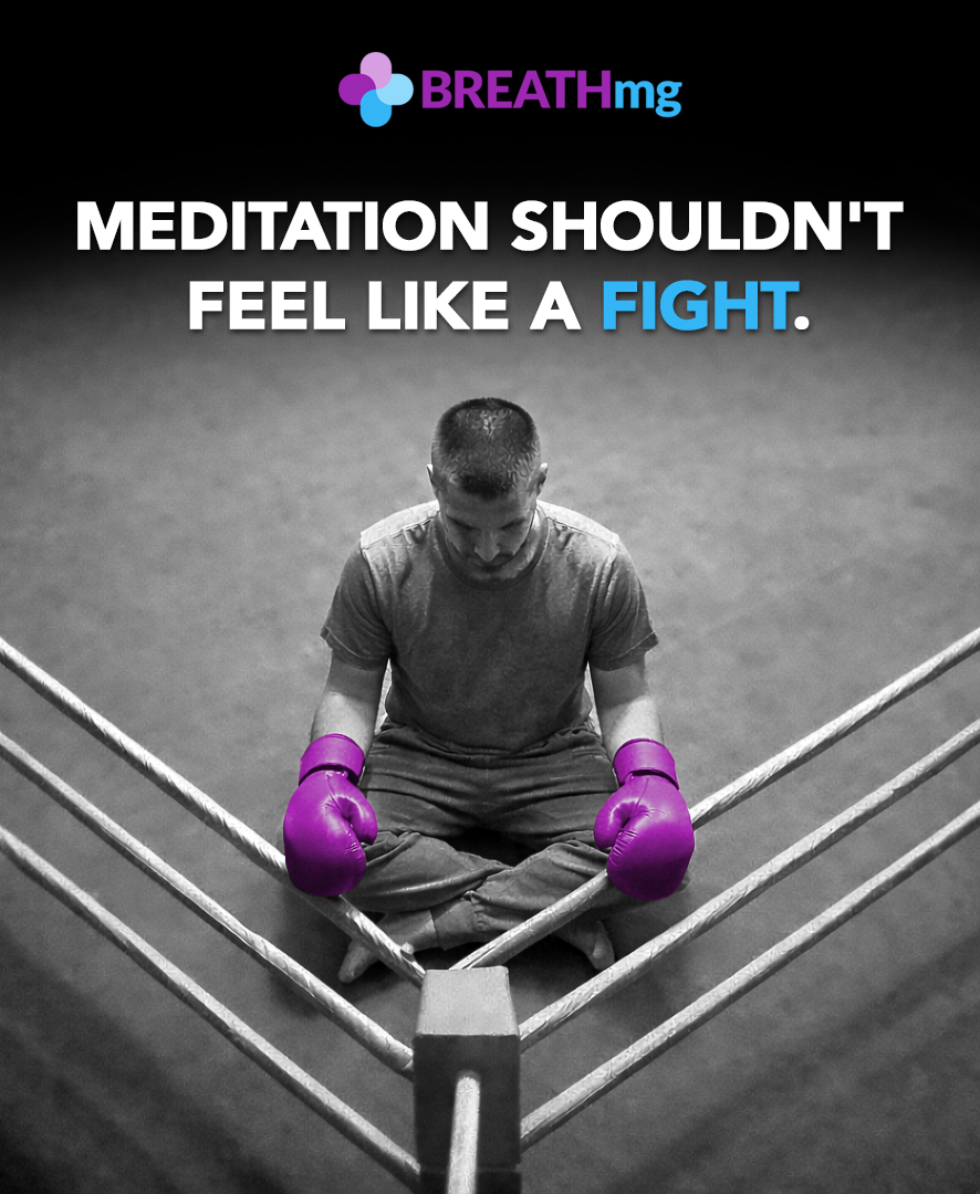
Black and white purple gloves illustration

The purple-glove direction pushed the brand toward a clinical, surreal, ownable visual language.

05The Writing

The Copy Moved From Philosophy to Practical Instruction

The writing went through several phases. Early versions leaned more heavily into Tibetan context, nervous system regulation, mental health, awareness, and the broader spiritual roots of breathwork. Some of that context mattered, but too much of it made the product feel heavier than it needed to be.

Over time, the product became more beginner-focused. The strongest version was not the one with the most explanation. It was the one that helped people start. The copy shifted toward practical language, short lessons, clear session instructions, and a simple promise: press play, follow along, build the habit.

The Tibetan connection still matters personally, but the product does not ask the user to enter through that door. That was a deliberate design decision. I removed most of the cultural and philosophical framing because the goal was to make the practice accessible, not more exotic or precious.

BREATHmg Tibetan connection visual asset

Earlier explorations leaned more heavily into Tibetan context before the product moved toward a simpler protocol-first frame.

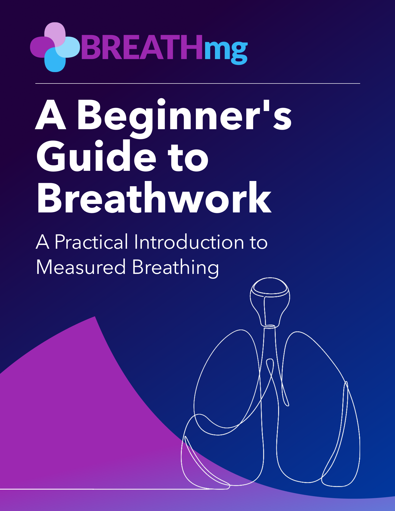
BREATHmg ebook cover

The ebook became the deeper instructional layer, while the public-facing product stayed focused on beginner clarity.

06The Product

The Program Split Into a Full Progression and a Beginner On-Ramp

As the product matured, it became clear that one offer had to do two jobs. It needed enough depth to support a complete 60-day program, but it also needed a low-friction entry point for people who had never tried breathwork before.

The full program includes 17 guided sessions, more than two hours of audio, morning and afternoon stacks, a program manual, quick-start material, trackers, and a 60-day progression that gradually builds breathing capacity, breath hold duration, and consistency.

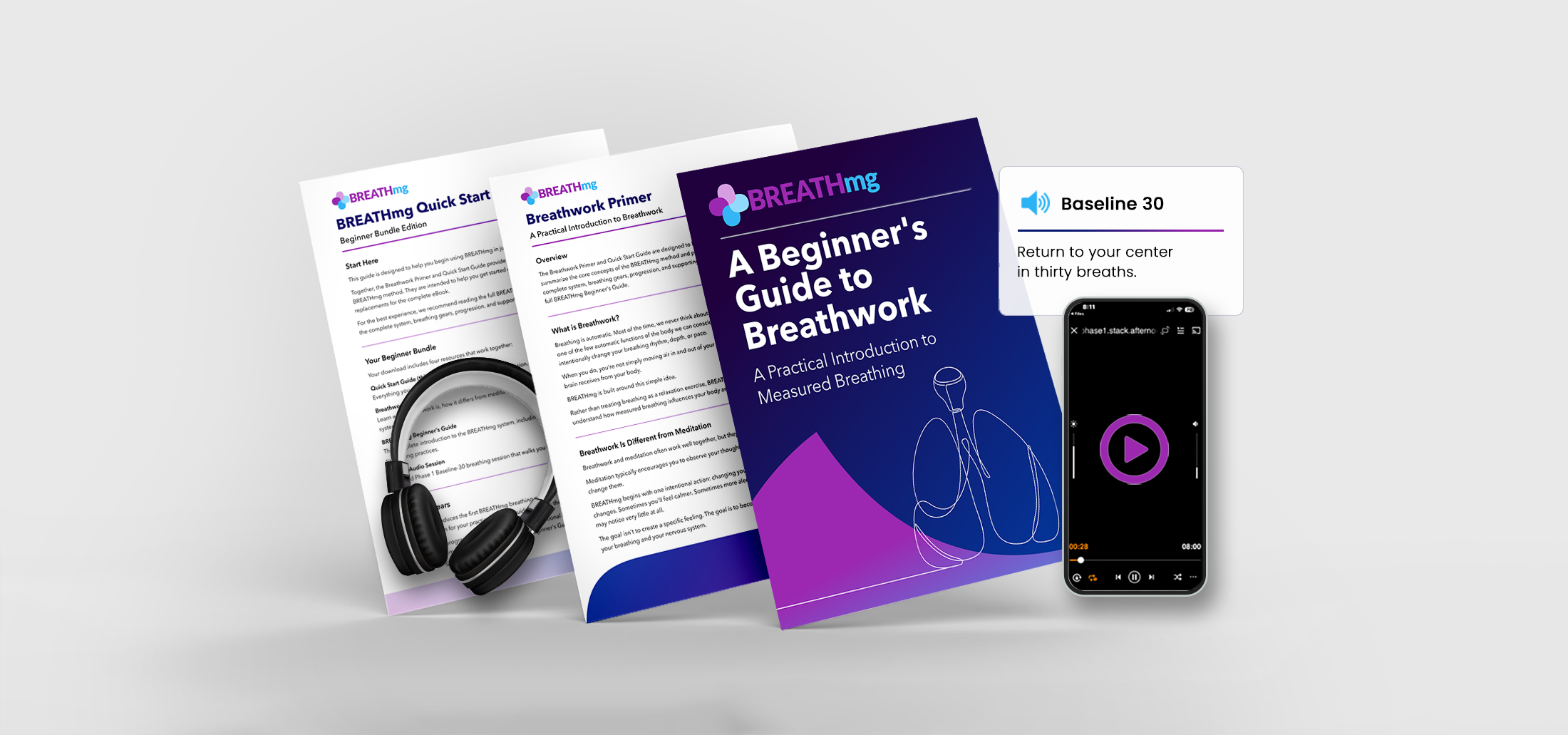
The beginner bundle became the lighter front door. Instead of asking someone to understand the entire program up front, it gives them a simple starting point with enough context to try the method immediately.

BREATHmg beginner bundle hero

The beginner bundle packages the on-ramp into one clear download, with enough guidance to start without overwhelm.

07The Audio

The Hardest Design Work Happened Inside the Guided Sessions

The audio was not just a deliverable. It was the product experience. Every guided session had to be written, scripted, recorded, assembled, paced, mixed, and tested as something a person could actually follow while breathing.

The challenge was not simply telling users when to inhale and exhale. It was deciding when to count, when to stop talking, when the music should support the session, when silence should lead, and when the track needed more space to breathe.

Those decisions were shaped by thousands of hours of my own practice. I knew when an instruction felt too early, when a hold needed reassurance, when a transition felt rushed, and when a cue helped the user stay inside the experience instead of thinking about the mechanics.

01 / ScriptWrite the instructional arc, breath cues, holds, transitions, and session close.
02 / VoiceRecord guidance with a tone that stays clear, calm, and out of the way.
03 / PaceEdit timing around the actual breathing experience, not a rigid script.
04 / MixLayer ambient sound, silence, count structure, and final export for use.
08The Production System

One Product Required a Whole Ecosystem of Assets

BREATHmg became a full production effort. I created the brand system, website, Shopify flow, ebook, program manual, quick-start guides, trackers, audio covers, guided sessions, bundle graphics, social posts, reels, and launch assets.

The hard part was keeping all of it coherent. The audio had to match the program structure. The manuals had to support the sessions without overexplaining them. The visuals had to make the dosage metaphor recognizable. The site had to make the offer understandable in seconds.

AI was part of the workflow, but not the finish line. I used it for exploration, visual prompts, and iteration, then refined assets manually in Photoshop, Procreate, Figma, and video tools so the final system felt intentional rather than generic.

01 / BrandName, logo, palette, capsule mark, visual language, and art direction.
02 / Program60-day structure, gears, stacks, written manuals, and trackers.
03 / AudioGuided files, voiceover, pacing, ambient backgrounds, and exports.
04 / LaunchShopify site, email capture, download flow, social content, and reels.
Facebook Post

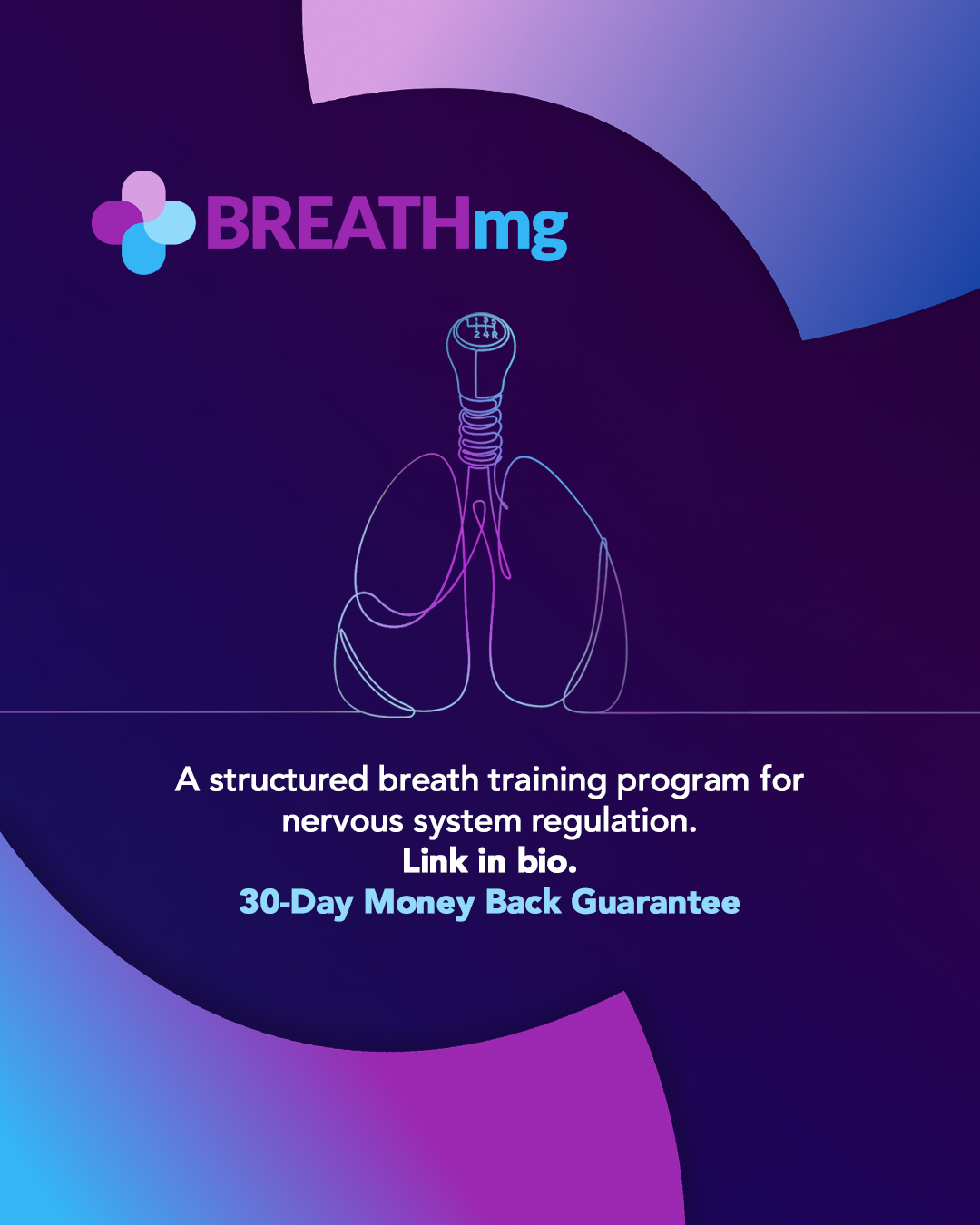
Social media carousel slide

Medication Campgaing

Carousel slide for social media campaign

Creator Kit

Asset package for creator partners and affiliates

BREATHmg ebook cover

Still from an animation sequence for a social media Reel

09The Takeaway

Good UX Is Not Limited to Software

BREATHmg is not only a wellness product. It is a product design case study about translating a difficult, culturally loaded, hard-to-explain practice into a usable program with a coherent brand, offer, content system, and production pipeline.

The most important design decision was subtraction. Remove the gatekeeping. Remove the mystical over-explanation. Remove the need to hunt through dozens of videos. Keep the parts that help people start and repeat: clear gears, guided sessions, progression, practical language, and a memorable metaphor.

That is the same design logic I use in software. Reduce cognitive load. Build intuitive mental models. Create useful defaults. Guide the user through small, repeatable successes. BREATHmg applies that thinking to breathwork, but the underlying skill is product design.

Product Strategy

Positioned breathwork as measurable training instead of vague wellness content.

Brand System

Built a distinct visual language around dosage, capsules, clinical surrealism, and progression.

Execution

Created the written, visual, audio, motion, site, and funnel assets needed to launch.