Product Design / Educational Technology / Data Visualization

Turning a static test report into a learning platform for students, tutors, and parents.

5 Month Engagement
3 Core Audiences
E2E Design to Front End

The project began with a Word document of raw data outputs and ended as a complete digital product.

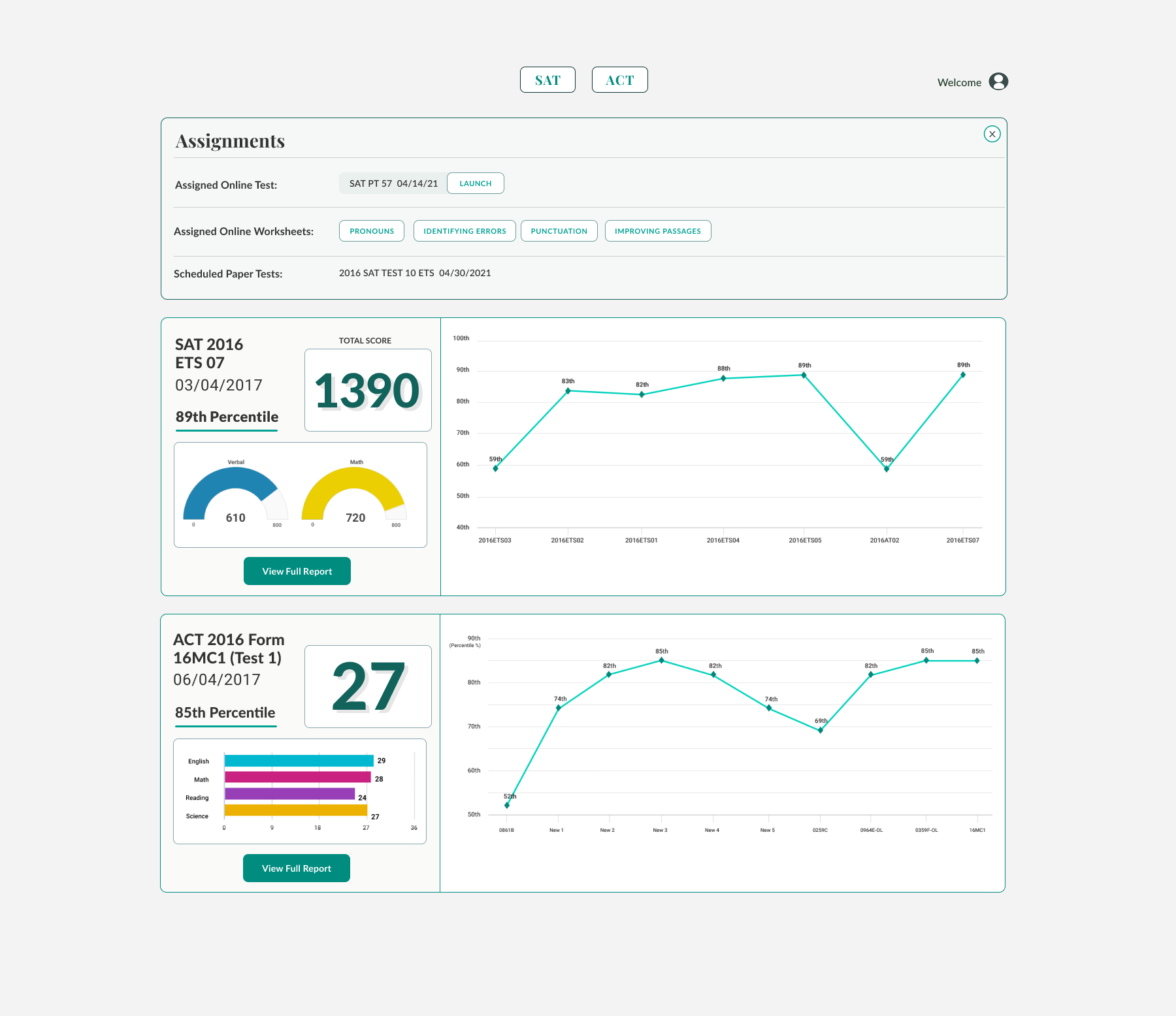
College test prep application dashboard

The final platform translated assessment data into a clearer working tool for tutors, students, and parents.

A long-time client and leader in college test preparation needed to adapt a business built around in-person tutoring to a rapidly changing hybrid model. Their reporting system was never designed to become a digital product. It existed as a Microsoft Word document populated with ASP.NET form fields.

The initial request was to redesign the reports. The actual opportunity was much larger. The data needed to become a product tutors could teach from, students could understand, and parents could interpret without needing someone to explain every score.

I partnered directly with the Technology Director across the full product lifecycle, from research, user stories, information architecture, wireframes, and visual design through custom data visualization styling and front-end HTML, CSS, and Bootstrap implementation.

01The Starting Point

The Product Began as a Word Document

The client had decades of expertise in tutoring and assessment, but the reporting experience had never been designed as software. The original specification was a Word document populated with raw ASP.NET outputs through form fields.

It technically displayed the information, but it did not create hierarchy, explain relationships, or help anyone decide what to do next. Scores, categories, trends, and individual answers all appeared as isolated data.

The first step was not visual design. It was understanding what the report needed to become.
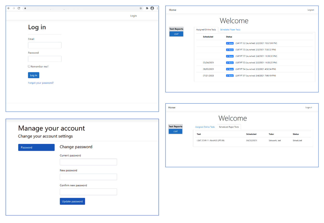
Original college test prep specification document

The client's original specification document exposed the reporting logic, but not yet a usable product experience.

The challenge was not to make the report prettier. It was to turn raw assessment data into something people could use.
02The Audiences

One Report Had to Serve Three Different Needs

The product initially appeared to have two primary users: tutors and students. Research quickly revealed a third audience with a very different perspective: parents.

Tutors needed diagnostic depth. They had to see patterns across questions, categories, tests, and time so they could tailor instruction. Students needed a clear understanding of where they were improving and where they were falling behind. Parents needed a high-level view of progress that felt credible, immediate, and easy to understand.

I worked through user stories, tutor and student interviews, and iterative discussions with the Technology Director to map what each audience needed at different levels of the experience.

Tutors

Needed diagnostic detail, historical comparisons, and fast access to areas requiring intervention.

Students

Needed feedback that felt understandable, motivating, and directly connected to improvement.

Parents

Needed a concise summary of progress without being forced to interpret every underlying metric.

03The Structure

From Individual Answers to a Year of Progress

The experience needed to work at multiple scales. At the smallest level, a tutor might inspect a single right or wrong answer. At the largest, they might compare performance across an entire year of reports.

That created a nested information architecture: question, category, section, test, and historical progress. Each layer needed to reveal more detail without losing the larger story.

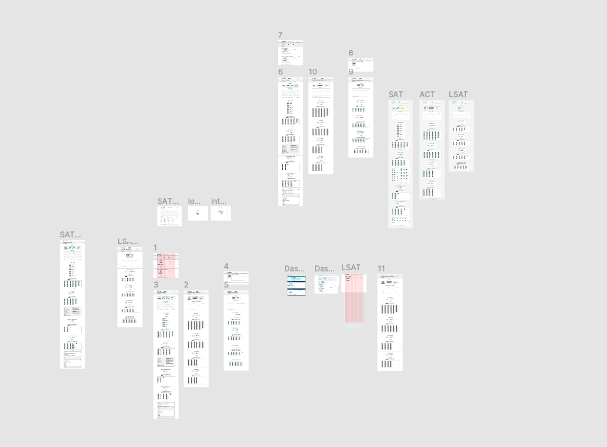
I explored multiple report templates and navigational models before converging on a system that let users move naturally between summary and detail.

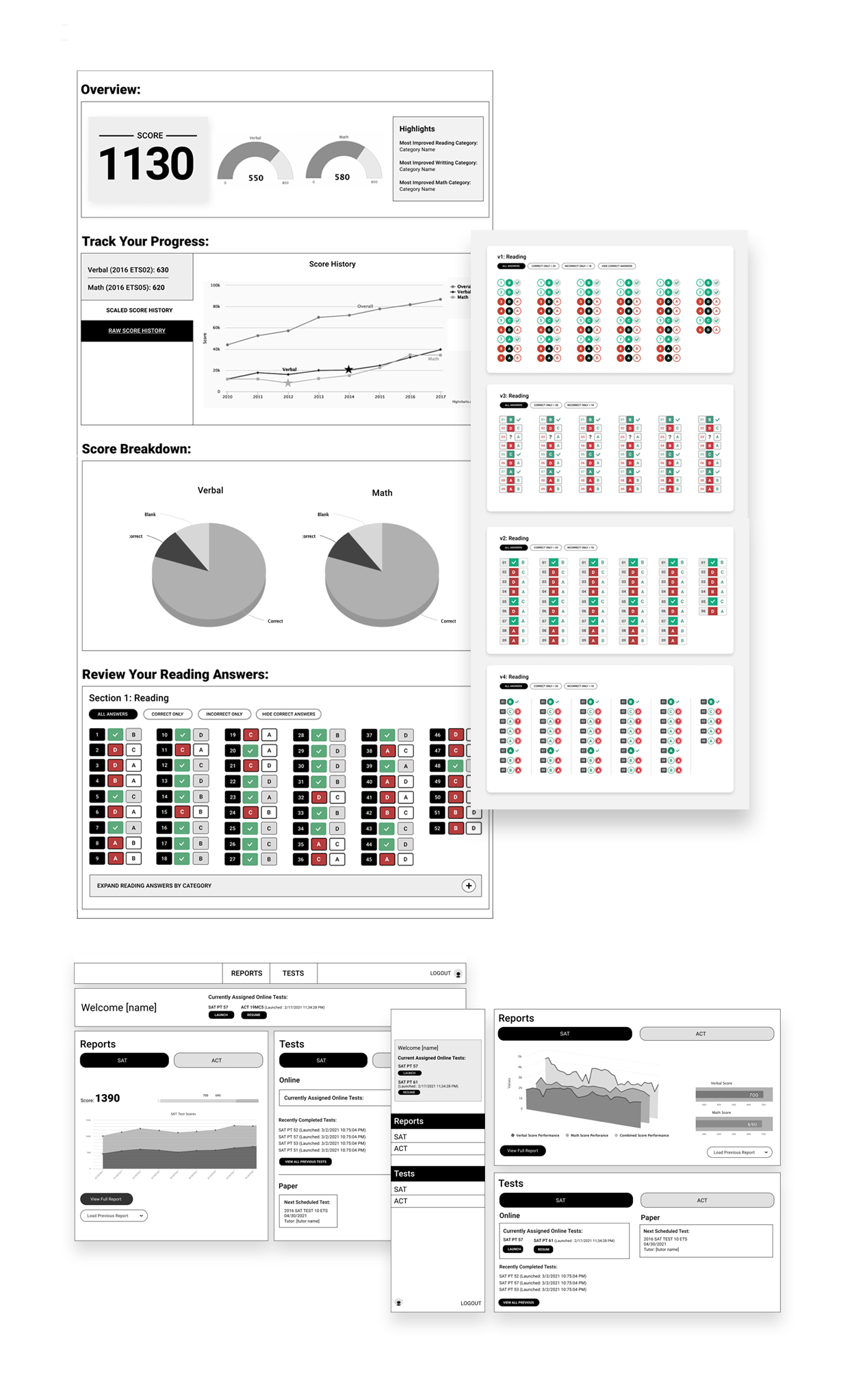
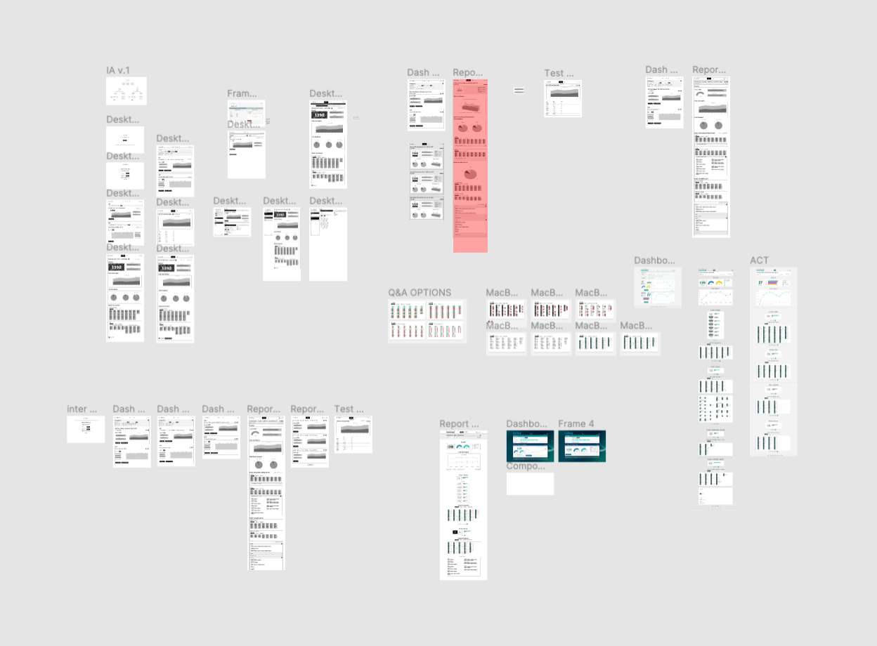
Early test prep report wireframe iteration

Early report templates explored how high-level summaries could lead into more detailed performance views.

Additional test prep report wireframe iteration

Multiple layouts were tested to balance assessment depth with a clear reading sequence.

Test prep app wireframe screens

The wireframes gradually established a consistent hierarchy across question, section, and historical data.

04The Visual Language

The Interface Had to Explain the Data Before Anyone Read It

Educational data can become overwhelming quickly. The interface needed to communicate performance through hierarchy, spacing, color, and visual weight before the user examined individual numbers.

I explored navigational structures, reusable UI patterns, score treatments, comparison views, and chart types that could make progress visible without oversimplifying it.

The goal was not decoration. Every visual decision had to help answer one of three questions: What happened? Why did it happen? What should we work on next?

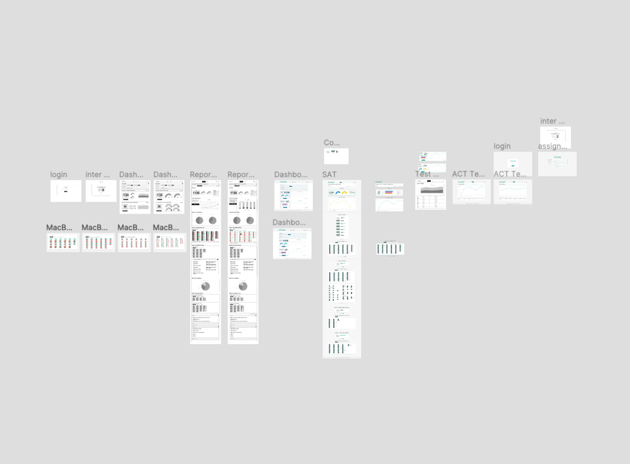
Test prep application navigation and data visualization exploration

Exploration of the navigational structure, interface patterns, and data visualization language.

05The Build

I Moved Into the Client's Stack Instead of Designing Around It

My normal workflow was centered on macOS and Figma. The client's internal team worked in Visual Studio, ASP.NET Core, Telerik, and Highcharts.

Rather than deliver static design files and leave the implementation decisions unresolved, I installed the development environment on my own system and began working directly with their component library.

I selected visualization patterns for the individual report metrics, edited JavaScript modules to customize chart skins and labels, and delivered a complete set of front-end HTML and CSS files based on Bootstrap 4.

01 / Research User stories, tutor and student interviews, requirements, and workflow mapping.
02 / Structure Information architecture, navigation, reporting hierarchy, and reusable UI patterns.
03 / Design Branding, visual system, Figma screens, chart selection, and interaction states.
04 / Build HTML, CSS, Bootstrap, Telerik customization, and JavaScript visualization styling.

The handoff was not a stack of screens. It was a working front-end foundation shaped around the client's actual development environment.

06The Final Product

One System, Multiple Assessments

The final product created a consistent reporting experience across the broader dashboard and individual ACT, SAT, and LSAT views.

Each assessment had its own structure and metrics, but the interface maintained a common visual and interaction language. Tutors could move between reports without relearning the product, while parents and students received a clearer view of performance and progress.

Final college test prep dashboard

The dashboard brought recent activity, performance summaries, and navigation into a single entry point.

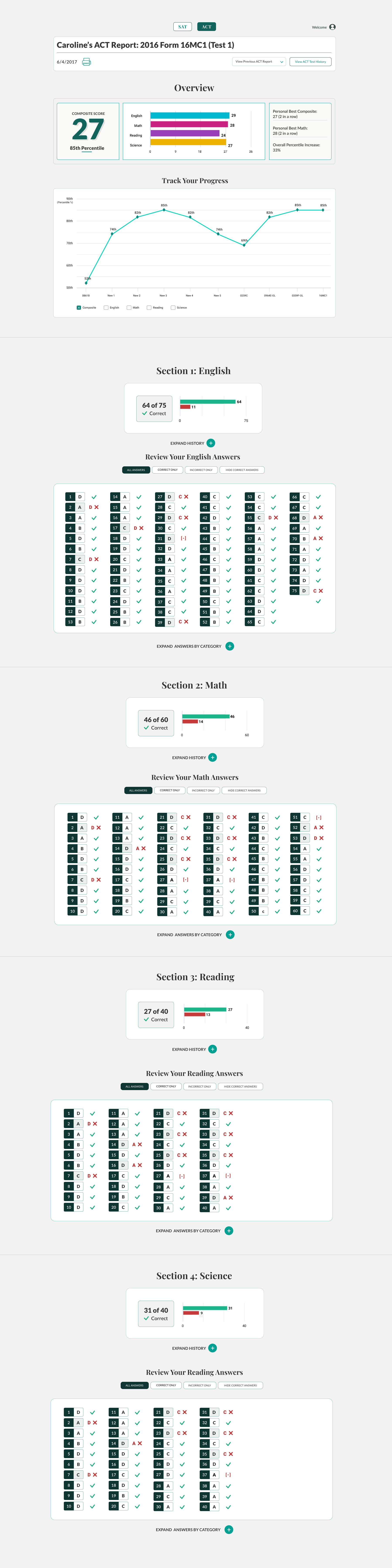
Final ACT report screen

ACT reporting translated section-level performance into a clear instructional view.

Final SAT report screen

SAT reporting applied the same system to a different test structure and set of metrics.

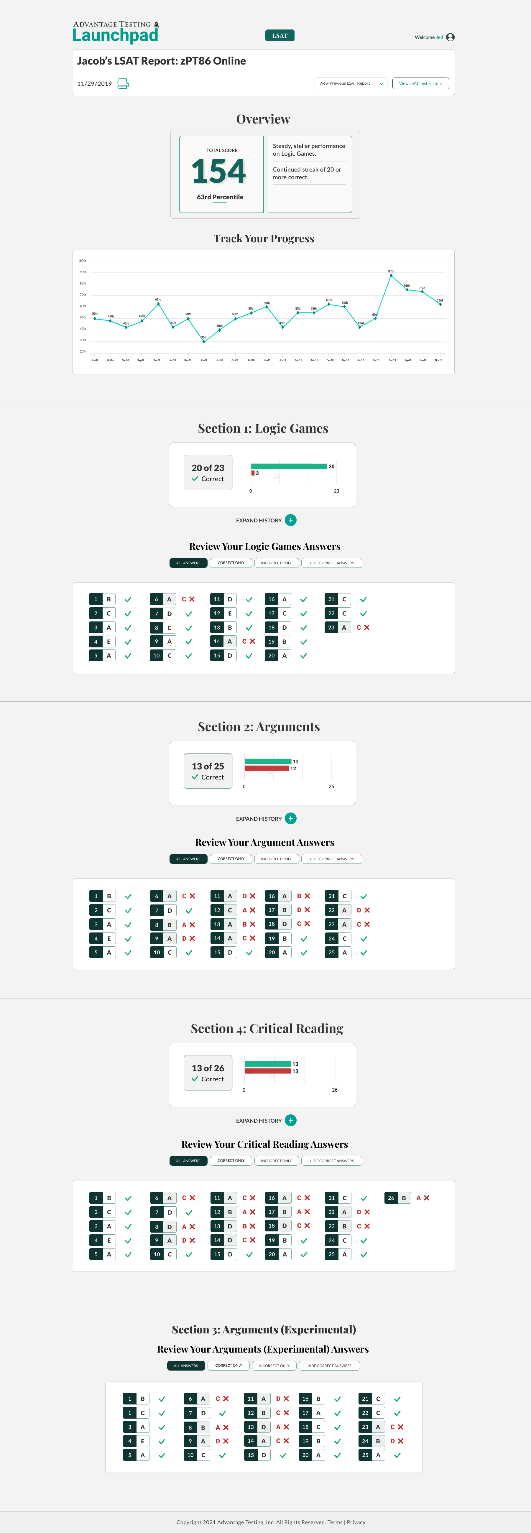
Final LSAT report screen

LSAT reporting demonstrated how the product language could scale across additional assessments.

07The Takeaway

Educational Products Are About More Than Displaying Information

This project began as a reporting redesign and became an end-to-end product engagement. The work required research, product definition, information architecture, interaction design, visual design, data visualization, and front-end execution.

The most important result was not a collection of polished dashboards. It was a shared product language that helped tutors teach, students understand their progress, and parents see the value of the instruction.

That is the core of the work: transforming complex information into a clear sequence of decisions and actions.

Product Definition

Expanded a narrow reporting request into a more complete learning and communication platform.

System Design

Created a reusable interface language across multiple tests, users, and levels of detail.

Execution

Delivered the brand, UX, UI, visualizations, and production-ready front-end foundation.